ScottFrenchASmediaproject
some white kid
Wednesday, 17 December 2014
Tuesday, 16 December 2014
Monday, 8 December 2014
Thursday, 27 November 2014
Thursday, 13 November 2014
Tuesday, 11 November 2014
Monday, 10 November 2014
music magazine contents page analysis
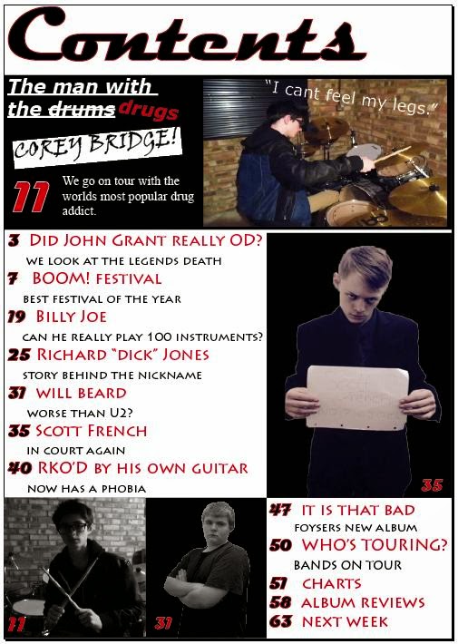
From the contents pages that I analysed I learnt that the main image is very important which is why it is normally the largest thing on the page and it sets the tone for the magazine. On one magazine the main image controlled the colour scheme and on all of them the images appeared to take priority over the text. the text on the contents pages was brief and was mainly just the features of that magazine. The words "contents" was also laid out differently in each magazine to make it unique and reflect the style of the magazine. One of them was in 3 different rows to imply that this magazine was is chaotic to match the central image whereas anothe one had skyscrapers in it to imply that the magazine is sky high. i am going to consider this when creating my contents page so people know the tone of the magazine and can know what its going to be about without having to read the features.
Subscribe to:
Comments (Atom)


